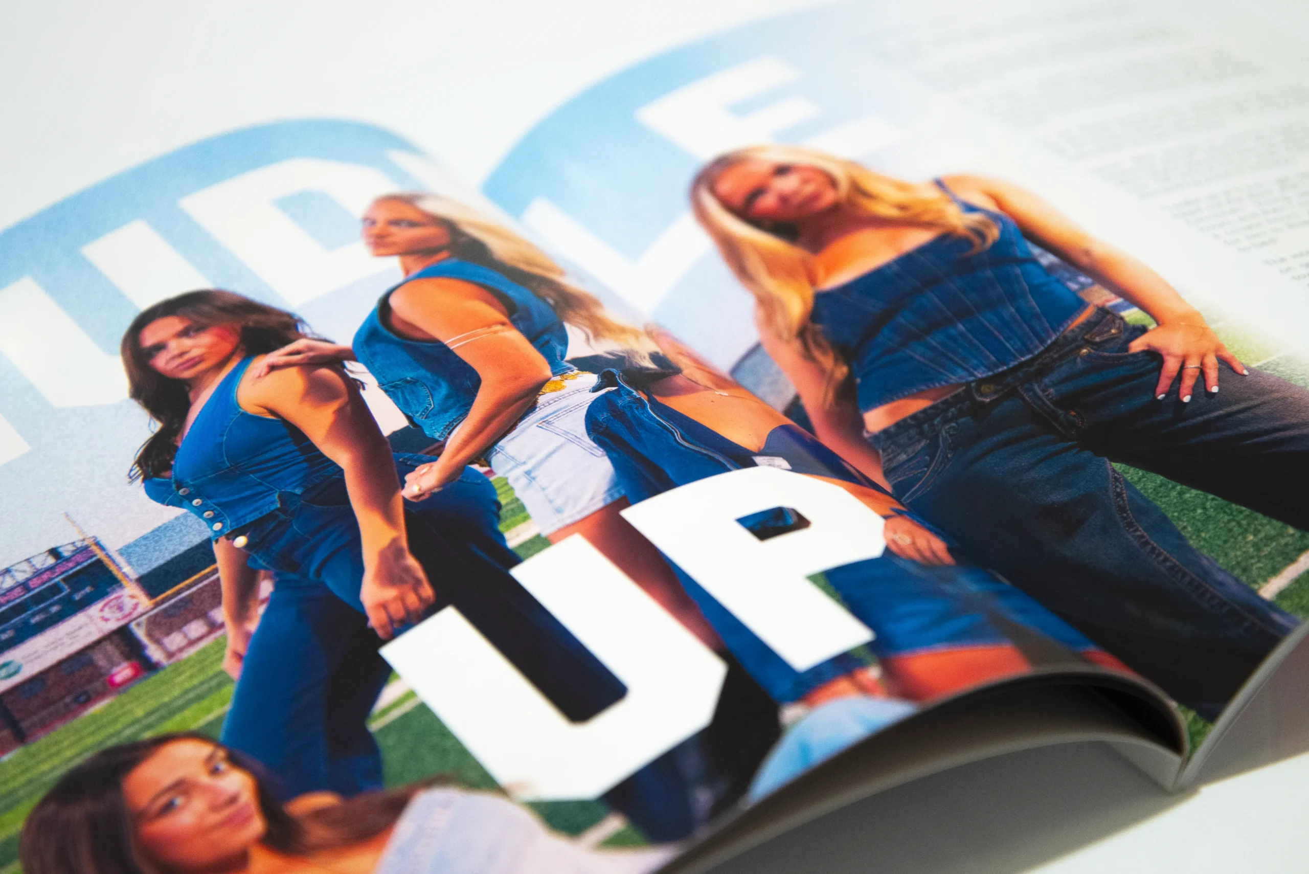
HUDDLE UP
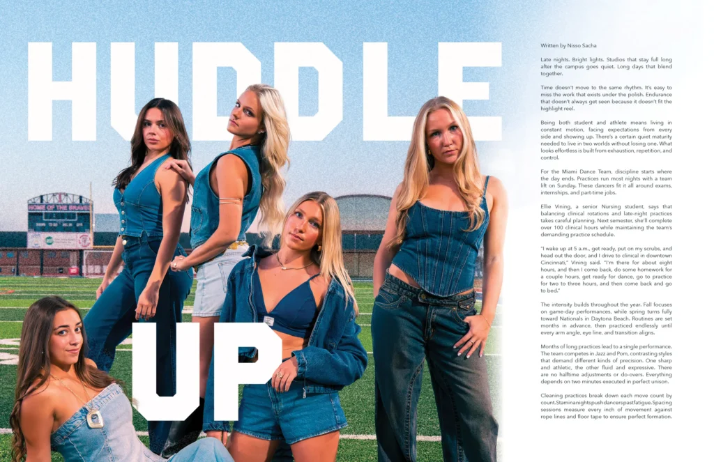
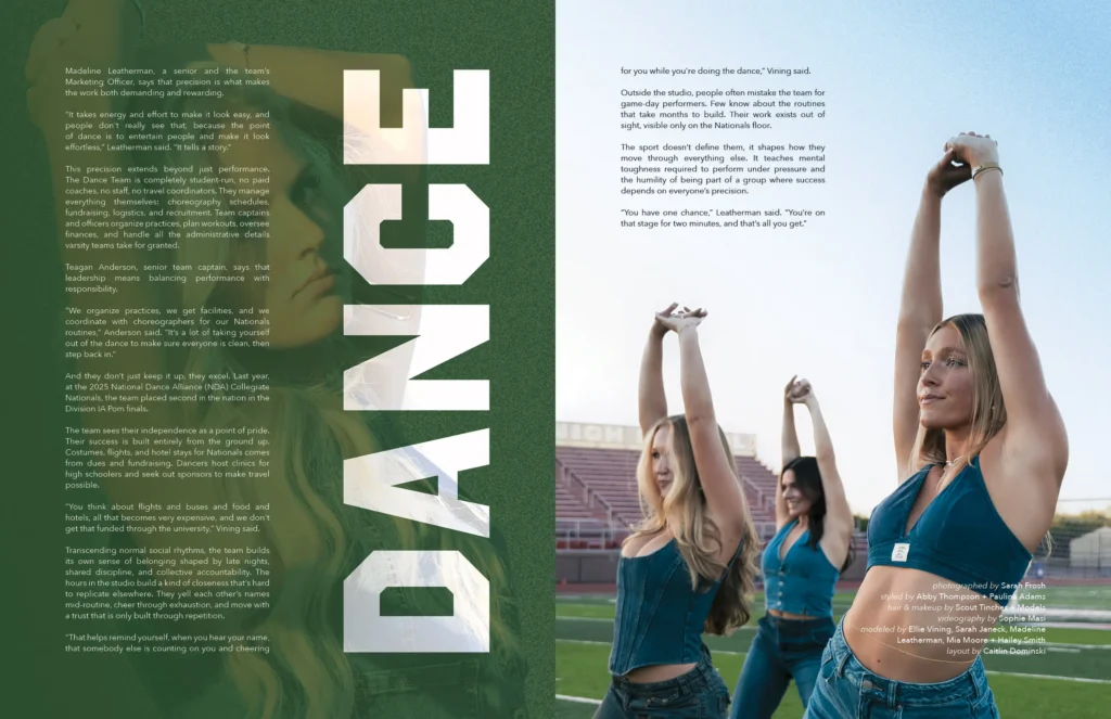
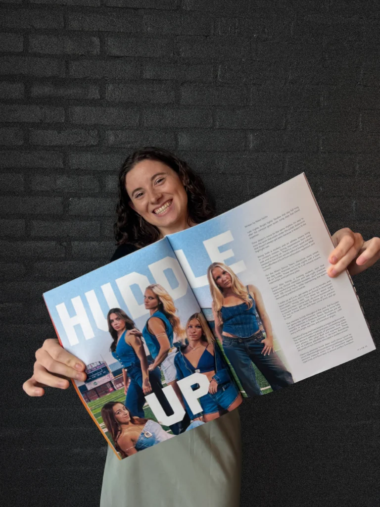
Huddle Up is a pair of spreads that I designed for Miami University’s UP Magazine. UP is Miami’s student-run fashion Magazine that stylistically places a great focus on photography. Spreads typically include large images, or several smaller images arranged in a striking way. I was assigned to design a story about Miami University’s dance team using photographs of several of the dancers taken on a football field!
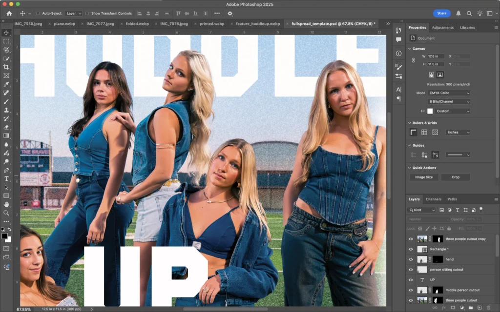
I was provided with around 20 photographs to choose from, so I started by selecting the ones I found most striking. I chose three and began to arrange them across the pages in InDesign. As I settled on a layout that I liked, I realized that I wanted to use type to engage the depth of field of the photographs. I opened my images in Photoshop and played with tucking certain letters behind the subjects, while keeping others in front. I also added some grain to the background to further separate it from the subjects in the foreground.
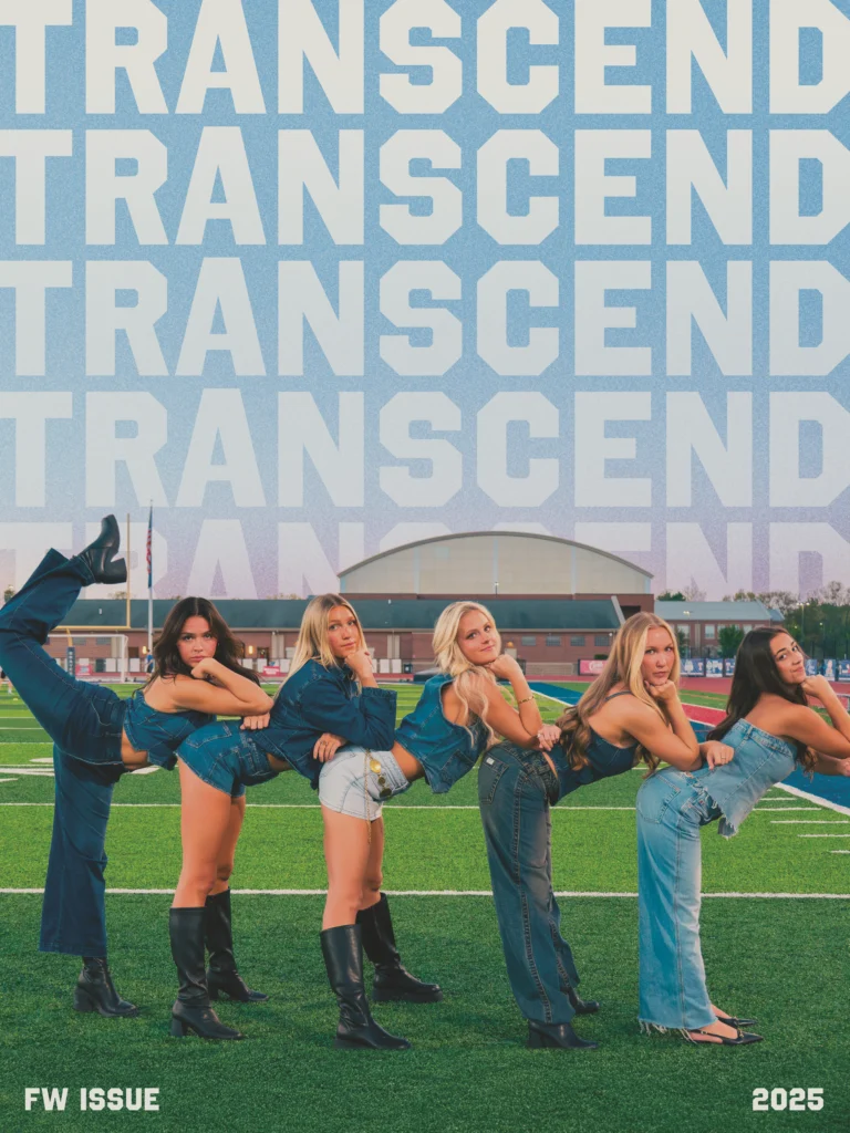
I was also able to create a poster for the release party to match my spread! My poster, pictured left, was created in Photoshop using many of the same techniques as were used in my spreads. I added grain to the background and used text to separate the foreground and background. The theme of this issue was Transcend, so the word “transcend” fades down along the sky and gets tucked behind the buildings.
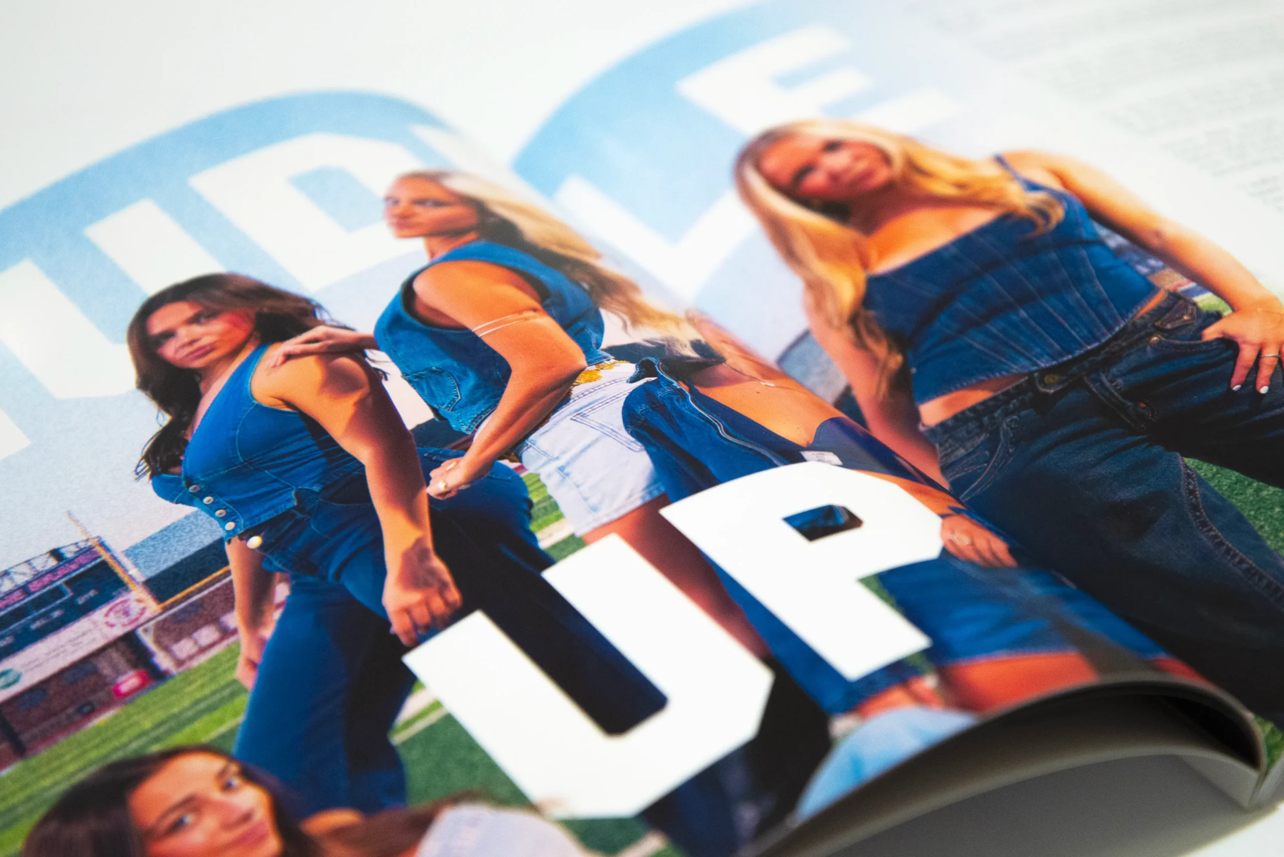
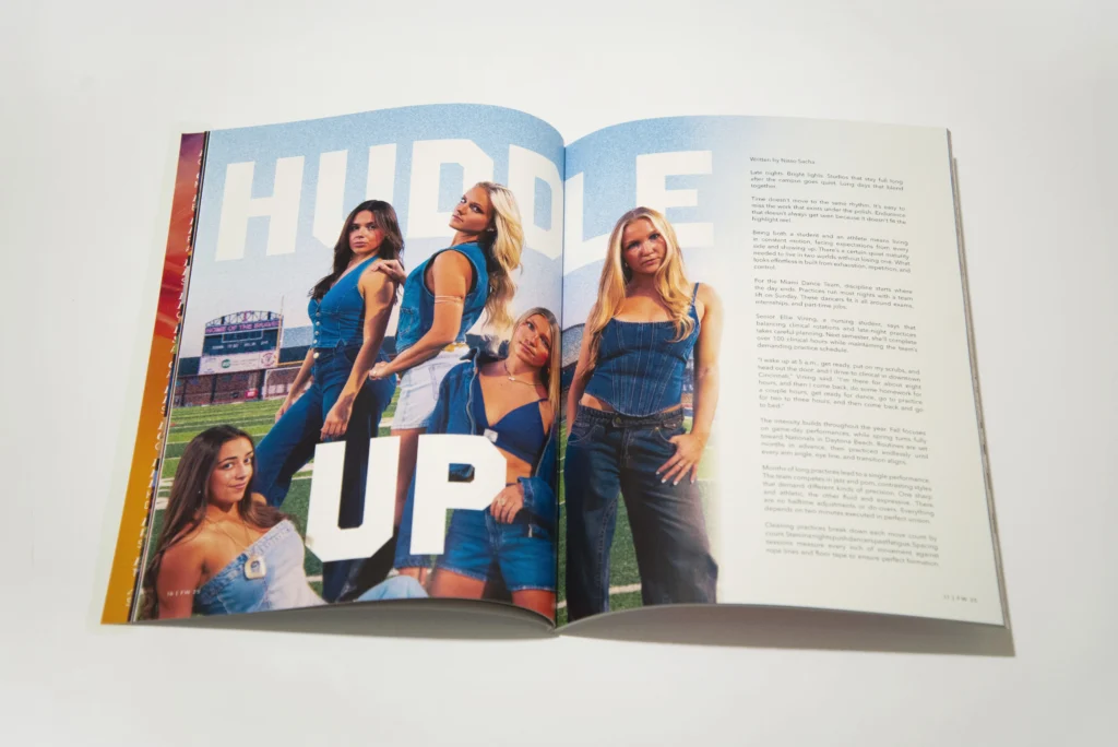
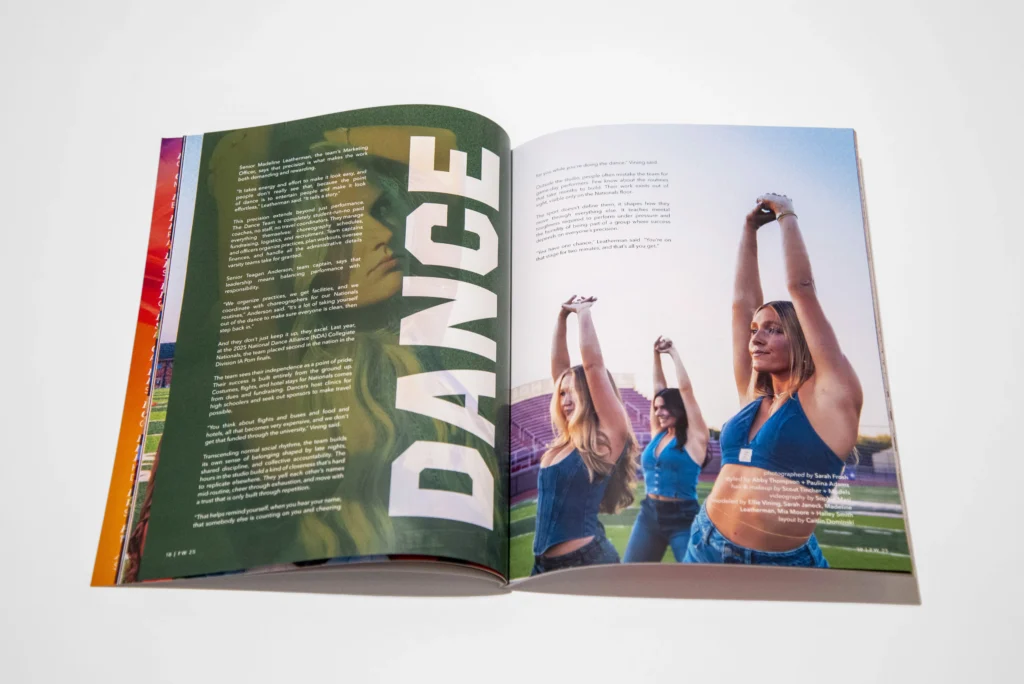
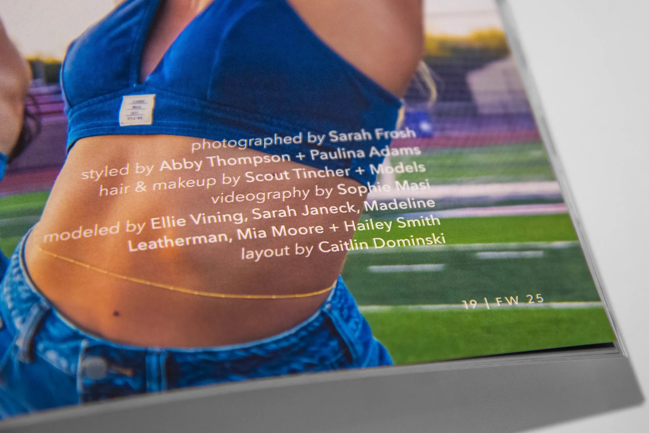
I learned a lot about working between Photoshop and Indesign in this project. I know both well, but had yet to do a layout design project using Photoshop as the primary design tool. I am usually more vector based, copying and pasting objects between Illustrator and Indesign. Knowing this, I wanted to push myself to design in a new way! One thing I wish I had done differently is add more space between the “D” and the “L” in huddle to account for the page crease. I did increase the tracking between these letters more than normal, however, after seeing the final spreads, I wish I had increased it more! (Fun fact: ever since this project, I’ve been obsessed with adding grain to images!)
